Nearly every small business and nonprofit has a website now – and if your organization doesn’t, it should. If you think you don’t need a website, we encourage you to take a look at one of the posts from our Marketing Myth series, “Marketing Myth #2: ‘I don’t need a website,’” where we explain why having a website matters.
But maybe you know you need a website but don’t know where to start. Or maybe you have a website, but it needs a few positive changes or an overall refresh. Whatever category you fall under, we’re sharing four tips to help design a professional site that represents your organization well. Here are few things to keep in mind as you create or refresh your small business website:
1. Provide Value
The amount of websites floating around the internet is immeasurable (someone’s probably measured it, but we have no idea how many websites are out there). On top of that, new websites are being created constantly.
So, what makes your website valuable among so many other websites? Do you have any helpful information or products that would draw people to your online space?
Keep in mind, your website content doesn’t have to be fancy – it just has to be relevant. Beyond keeping your contact information up-to-date (which you should definitely do), it’s important to creatively incorporate ways to showcase your products or services by providing ideas and inspirations for your customers.
For example: If you manage a homemade baked goods shop, it would add value to your site to do a weekly blog showcasing your products at local events or providing fun recipes or ideas for customers.
2. Keep it Simple and Sweet
As we said above, it doesn’t have to be fancy, but it does have to be relevant (and readable). One of the most common (big) mistakes we have seen in small business websites is that they’re trying to do too much. Boxes of content everywhere. Scrolling thing-a-majigs. Twelve banners.
Remember that less is more – especially in the world of the inter-webs where everyone consumes information in bite-sized chunks and people can’t read the same article for more than 30 seconds (sad, but true).
Your goal should always be to help customers or clients understand who you are and what you do. While we do encourage organizations to incorporate a blog with valuable information, it’s important you provide your valuable information in a readable, digestible way.
Even if your site contains nuggets of gold, a home page or blog that’s a cluttered mess will prevent customers from finding the value you offer. The key: get to the point.
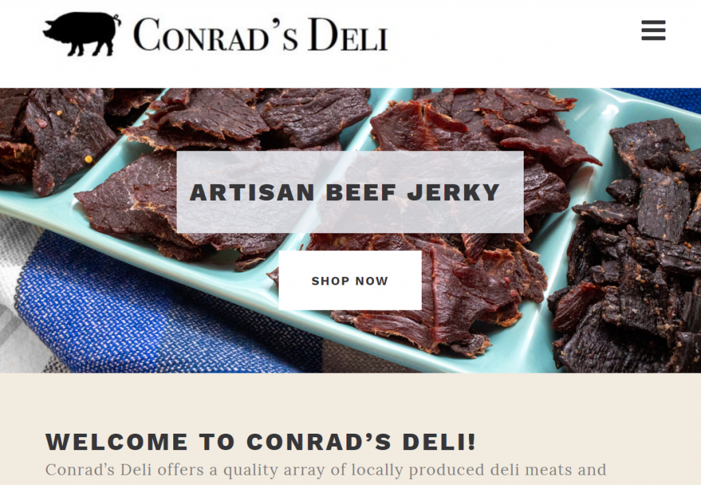
For example: Make sure your homepage has the information you most want guests to see FIRST – the variety you offer, the quality of your products, promotional events and campaigns, etc. Keep pages short, clean and to the point. Make the menus easy to find and user-friendly!

3. Visually Represent Your Brand
Just as keeping a clean, digestible website is a priority, it’s important to incorporate a website design that truly reflects who you are and what you care about.
While the stylistic aspect of your website may be the last thing on your mind as a small business owner or manager, your site’s visual appeal is fundamental to how your audience perceives your organization’s professionalism.
In another one of our blog posts from our Marketing Myths series, we discussed graphics and branding’s crucial role for your small business or nonprofit. We encourage you to read the whole blog post to unpack this topic further, but here’s an excerpt that will give you the gist:
“Your organization’s user-experience will impact whether or not your target audience trusts your product or service, and professional branding is a determining factor in that experience.”
– Ready Media, “Marketing Myth #5: ‘No one cares about branding and graphic design.'”
To sum it up: if your website is quality, people probably will assume your product is quality. If your website is not quality, people probably will assume your product is not quality (whether it’s true or not).
For example: Let’s say you sell custom-made, hand-carved wooden figurines of quality, but your website is a visual cacophony. It includes subpar photos of your products (note: quality photography on your website is also essential to a visually appealing site), unreadable fonts and disorienting color schemes. There’s a good chance this will deter customers from purchasing from you- especially if someone else sells what you sell- despite the actual value and beauty of your product.
Whether or not customers recognize their connection with the visual aspect of your website, their perception of your professionalism will absolutely be influenced.
4. Stay Current
As you refine your content to be valuable and relevant, it’s important to consistently update and refresh said content, as well. While your customers may not be checking your website frequently on their own, keeping your content fresh will not only provide you with updated material to share on your social media platforms and advertising but will also keep you relevant in the eyes of Google and other search engines.
We talk a little bit about search engine optimization (SEO) in our “Marketing Myth #2” post:
“Search engines determine what information is valuable through an algorithm, and thus, they control which information, if any, is circulating about your business. In order to let Google know you’re a real, active organization, it’s important that your site be optimized for Google’s requirements (aka “search engine optimization” or SEO).
SEO includes managing keywords in your content, utilizing photos and media throughout your site, frequently updating your website with fresh and useful material, and more.”
To expound a bit, the more you update your website with valuable information, the more likely Google will recognize you as valid and give you exposure on their search engine.
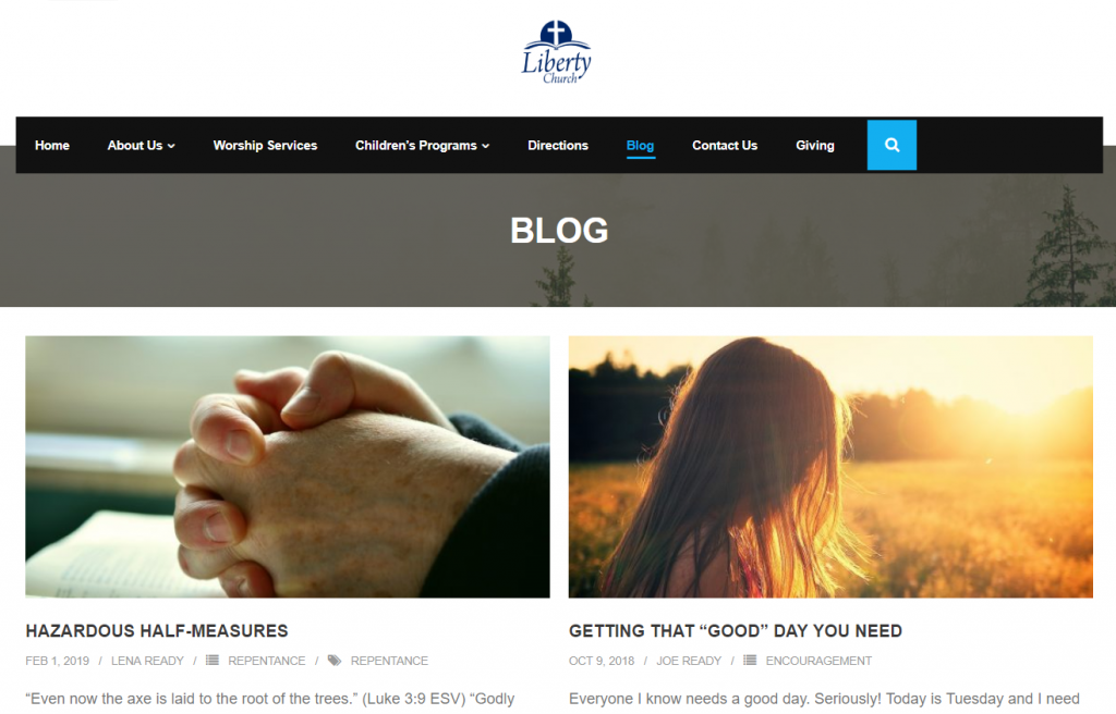
One easy way to do this is through a blog. Writing even simple, short posts a few times a month (or more if possible!) will keep relevant information cycling through your website. This will tell Google’s algorithm that your site provides value to the internet and should be listed with priority.
For example: If you’re a produce market stand in Berks County, Pennsylvania and want your website to be the first to show up when people search “fresh fruit in Berks County,” you must frequently blog with key words that would relate to that search.

We’re Here for You
If you’re getting a little bit overwhelmed with all of the details that go into website design and upkeep, you don’t need to be! We would love to be a resource for your small business or nonprofit as you seek to creatively reflect your organization with professionalism.
Contact us today to discuss what steps we can take to bring your website to the next level!


